
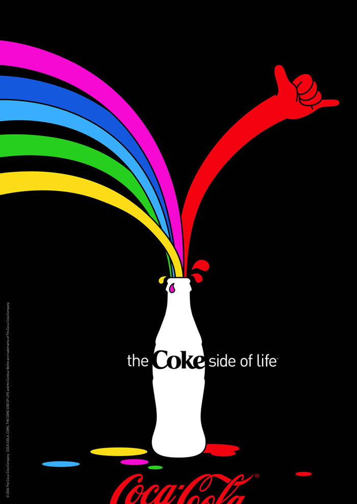
This is an ad by Coke that was a part of their “Coke Side of Life” campaign that was launched in 2006 and won the 2007 Creativity Award, with Al Moesely and John Norman working as the executive creative directors. This ad has numerous design qualities, namely negative space, asymmetry, and contrast. https://www.designyourway.net/drb/clash-of-the-titans-coca-cola-and-pepsi-print-ads/
Contrast
This design uses contrast by providing many different vibrant colors that stand out on the deep black background. Nothing is dull or muted, and the eye is attracted to the many different bright colors.
Repetition
This ad uses the design principle of repetition by repeating several different elements of this design. We can see that it repeats the curved strokes/lines going into the bottle, as well as the spills or spots on the bottom of the design. All of these repeating elements work together to create a cohesive design.
Alignment
If we draw lines through this ad, we can see that the design is aligned nicely and isn’t off-kilter in anyway. The design itself is asymmetrical, but still looks balanced and is designed in such a way that the alignment is on point.
Proximity
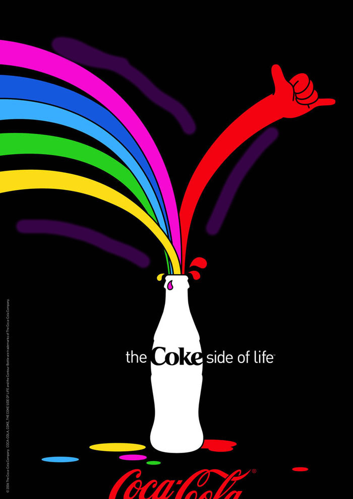
We can see in this design the principle of Proximity used by looking at the curved strokes/lines that are going into the bottle. They are grouped closely together, so we can assume that they have a relationship. It also helps us better understand their relationship, which in this case would look like something that is pouring into the bottle itself.
Color
This design has great color choices. We can see that the designers chose very vibrant colors, and a color palette that is very different and stands out. All of this is aimed to better grab the client’s attention, and help them understand the message better and to be more aesthetically pleasing.
Conclusion
In conclusion, all of these design principles are used to create a cohesive and eye-pleasing design. These principles help the designer’s get the idea across to the client, and hopefully catch the client’s eye and make an impression on them.
