This magazine layout spread was featured in the Vogue January 2018 edition, and was authored by Alexis Okeowo and photographed by Mikael Jansson. The subject of the article was Lupita Nyong’o. The link to the article can be found here: https://archive.vogue.com/article/2018/01/01/move-it
The two different kinds of font families used in this layout are serif, and sans serif. You can tell the heading and bigger paragraph text is serif, because of the “feet” on the letters. The smaller paragraph in the upper right hand corner is sans-serif, which means they letters and characters don’t have the “feet” that serif fonts do.
What makes these two fonts contrasting would be the difference in their font families, meaning one is serif and one sans-serif. The serif font gives the page a bit of a more sophisticated feel, while the sans-serif contrasts that and seems more simple and educational, getting the point across immediately without any extra font design to distract the eye.
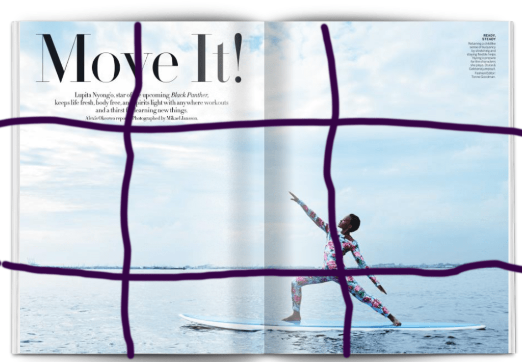
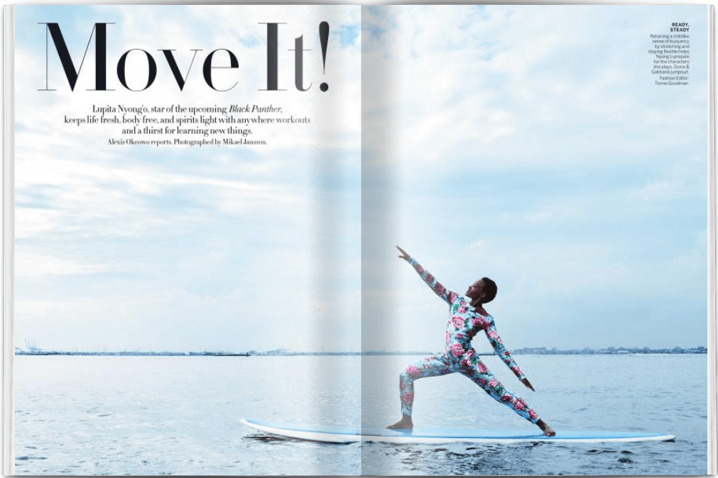
The photographer used the rule of thirds in this photograph. The photo composition can be equally divided into thirds, and Lupita was placed strategically on the intersection of those dividing lines. The ocean makes up most of the photo, but Lupita’s particular placement brings our eyes right to her as the focal point.
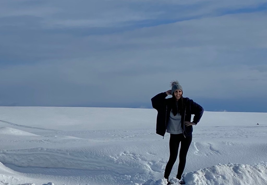
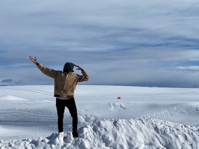
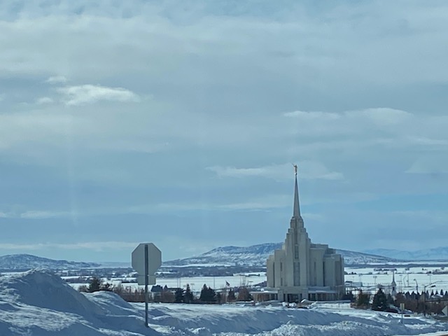
These three photographs I captured and included would work just as well if they were swapped with the original design because they all utilize the Rule of Thirds. Every subject in them is strategically placed to fit the rule perfectly and to look aesthetically pleasing.
In conclusion, all of these design principles work together to create one harmonious and eye-catching piece by each principle bringing to the table something different and unique. We shouldn’t be afraid of combining principles in our designs!
