Mrs. Meyers Ad Analysis
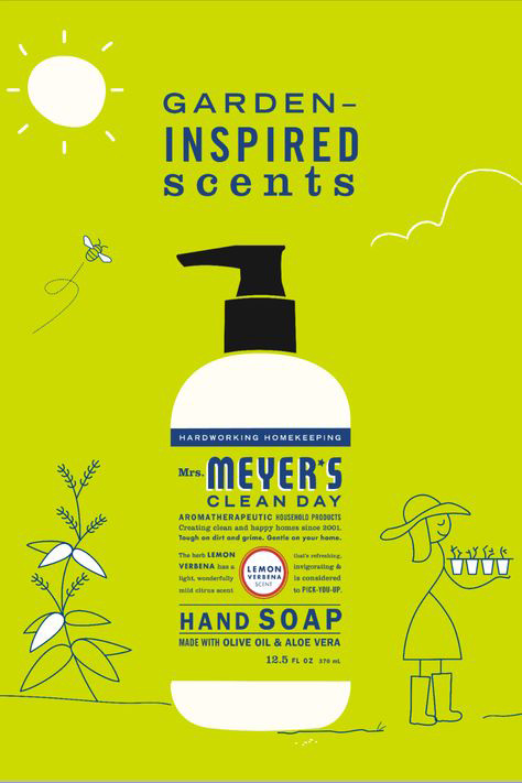
I love the way the designer used the different colors in this ad to communicate the clean and fresh theme. Using the background color that is a wonderful mix of green and yellow really makes the garden theme pop. Using some white space really accentuates the design.
I love the way the designer used contrast in the typography to communicate the theme and the ideas of the ad. Alternating the fonts really catches the reader’s eye. The significantly different font on the word “Meyer’s” immediately grabs your attention.
I like the asymmetrical balance of this design. Different sketches on the background of this ad on each side really makes the ad more interesting and visually appealing.
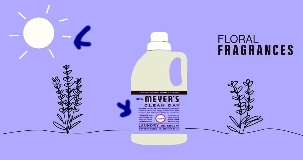
On my own ad design, I mimicked the original ad by using the same kind colors and color contrast. I used the color purple to communicate the “lavender” theme better, and used the same dark dark brown and white like the first ad uses.
I used asymmetrical balance in my design by making my own sketches on the background and varying them on each side. One lavender bush has three stems, the other has two. One side has a sun, the other has the font. It carries the reader’s eye across the page.
I tried my best to mimic the original ad by contrasting the typography in the logo and in the title in the corner. The title in the corner has a thicker and thinner font to really carry the eye, creating a bit of visual hierarchy.
In Conclusion:
I think both of these ads work together by using the same kind of contrast, color scheme and symbolism.
