Mrs. Meyers Ad Analysis I love the way the designer used the different colors in this ad to communicate the clean and fresh theme. Using the background color that is a wonderful mix of green and yellow really makes the garden theme pop. Using some white space really accentuates the design. I love the wayContinue reading “Mrs. Meyer’s Ad Campaign”
Category Archives: Reverse Engineer
Magazine Analysis
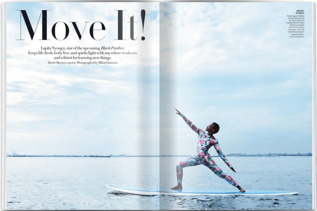
This magazine layout spread was featured in the Vogue January 2018 edition, and was authored by Alexis Okeowo and photographed by Mikael Jansson. The subject of the article was Lupita Nyong’o. The link to the article can be found here: https://archive.vogue.com/article/2018/01/01/move-it The two different kinds of font families used in this layout are serif, andContinue reading “Magazine Analysis”
Coke Ad Design Qualities
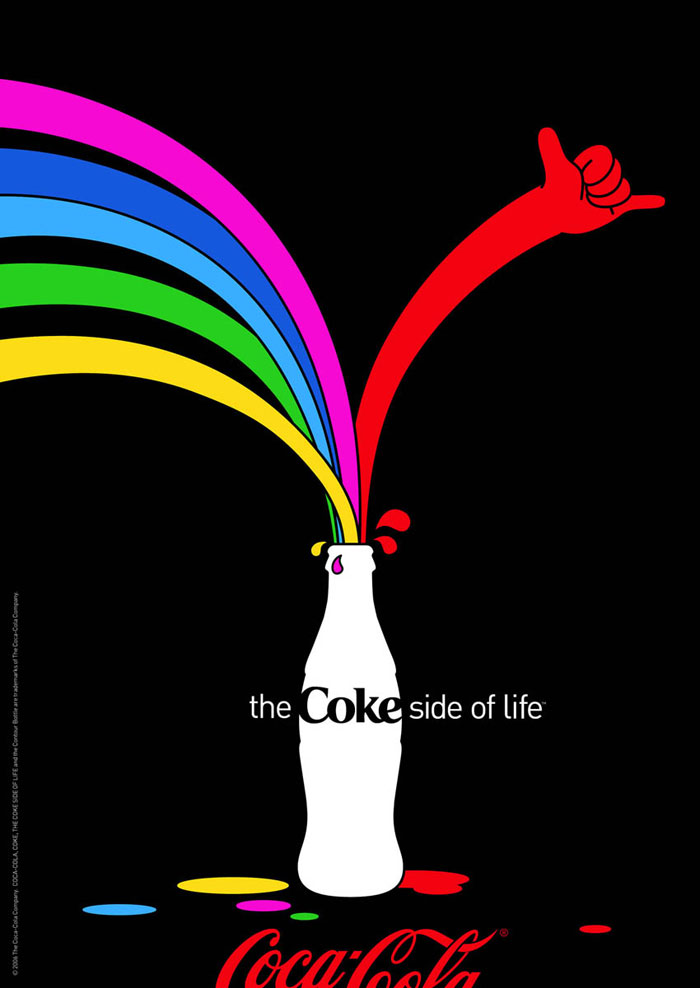
This is an ad by Coke that was a part of their “Coke Side of Life” campaign that was launched in 2006 and won the 2007 Creativity Award, with Al Moesely and John Norman working as the executive creative directors. This ad has numerous design qualities, namely negative space, asymmetry, and contrast. https://www.designyourway.net/drb/clash-of-the-titans-coca-cola-and-pepsi-print-ads/ Contrast ThisContinue reading “Coke Ad Design Qualities”
